Contact Details
The Contact Details component displays contact information for a person or organisation. It can include phone numbers, email addresses, and website links.
Contact channel icons (phone, email, Facebook, etc) are automatically displayed based on the type of contact information provided.
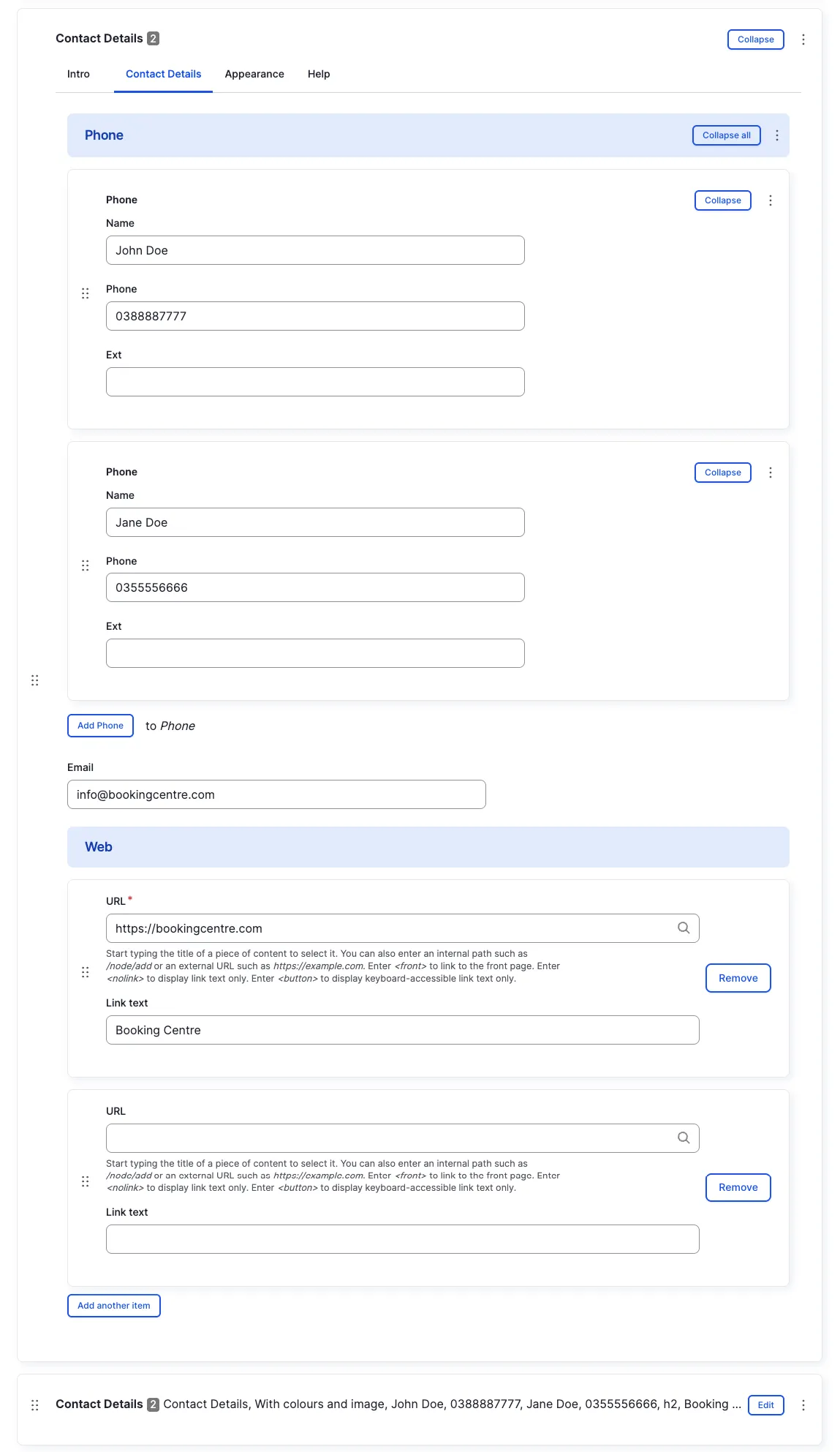

Intro tab
Section titled “Intro tab”Options in the Intro tab are covered in the Components section.
Contact Details tab
Section titled “Contact Details tab”Phone numbers become clickable tel: links that dial the number when
clicked on mobile devices.
You may add multiple phone numbers with labels (office, mobile, etc).
The email address becomes a clickable mailto: link that opens the
default email client when clicked.
Social Links
Section titled “Social Links”Links to social media profiles (Facebook, Twitter/X, Instagram, etc). Icons are displayed automatically based on the URL.
Appearance Admin
Section titled “Appearance ”An image can be added to display a person’s photo or an organisation’s logo alongside the contact details.
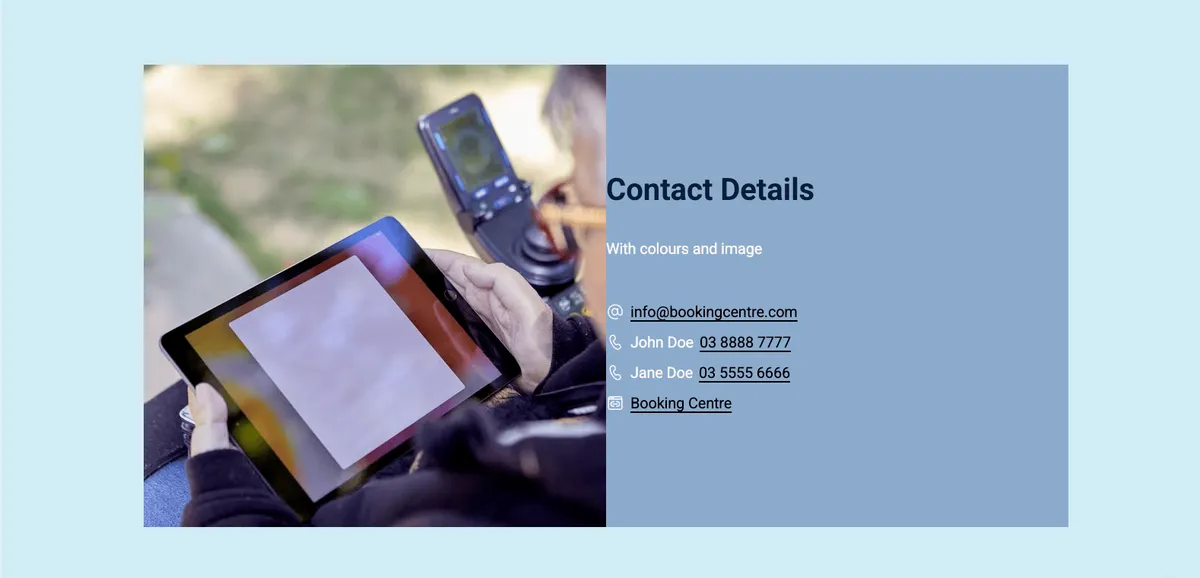
Other options in the Appearance tab are covered in the Components section.
All fields (technical reference) — 14 fields
| Field name | Machine name | Type | Role |
|---|---|---|---|
field_dmz_email | Editor | ||
| Hidden | field_dmz_hidden | boolean | Editor |
| Buttons (legacy) | field_dmz_links | link | Deprecated |
| Background Media | field_dmz_media | reference (image, video, fotoweb) | Admin |
| More Link | field_dmz_more_link | link | Editor |
| Outer Background | field_dmz_palette_color_1 | list_string | Admin |
| Inner Background | field_dmz_palette_color_2 | list_string | Admin |
| Content Background | field_dmz_palette_color_3 | list_string | Admin |
| Phone Numbers | field_dmz_phone_list | ref_revisions (dmz_phone) | Editor |
| Section ID | field_dmz_section_id | string (max 255) | Admin |
| Social Links | field_dmz_social_links | link | Editor |
| Introductory Text | field_dmz_text | text | Editor |
| Introductory Title | field_dmz_title | text | Editor |
| Title Heading Level | field_dmz_title_tag | list_string | Admin |