Photos
The Photos component lets you add photos to your page. You can display multiple photos as a carousel (scrollable gallery) or a collage (arranged grid).
Intro tab
Section titled “Intro tab”Options in the Intro tab are covered in the Components section.
Photos tab
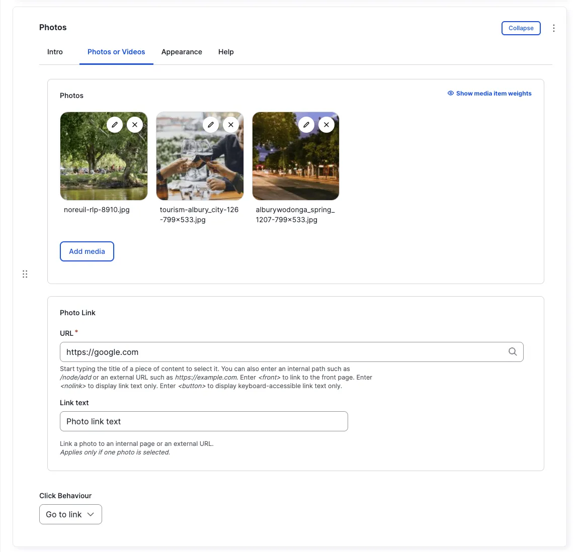
Section titled “Photos tab”Photos
Section titled “Photos”Add one or more images from the Media Library.
See Media Library for more information on uploading and managing media files.
Click Behaviour
Section titled “Click Behaviour”Historically, this setting controlled what happened when a photo was clicked: opening in a Lightbox overlay, or navigating to a specified Go to link URL.
Appearance Admin
Section titled “Appearance ”Photo Style
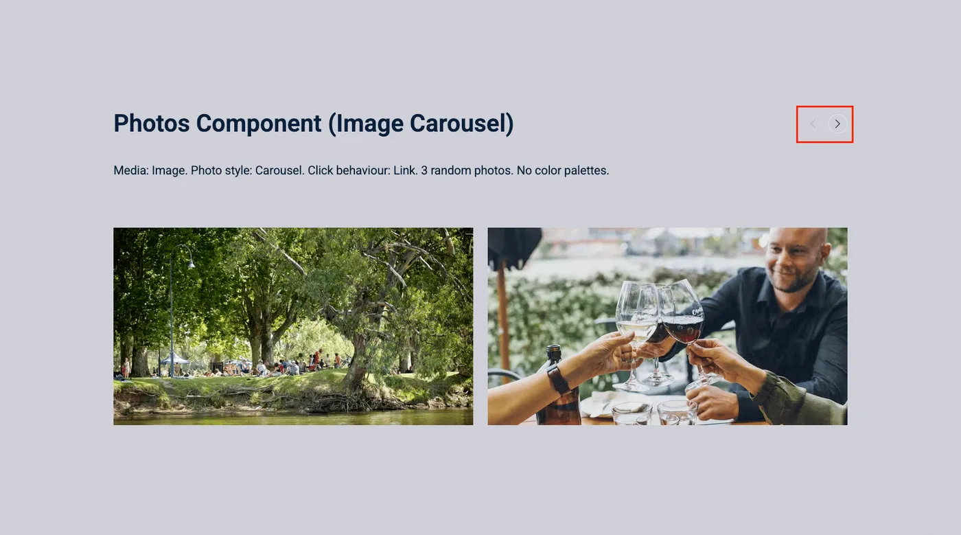
Section titled “Photo Style”How multiple photos are presented.
Photos displayed in a scrollable carousel gallery.
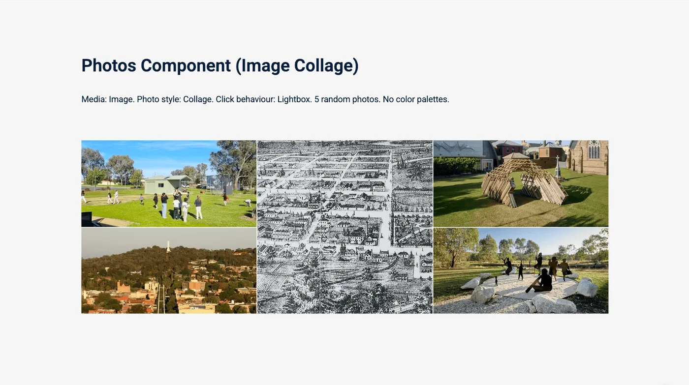
Photos arranged in a collage grid.
Resize Options
Section titled “Resize Options”How photos are resized:
The system chooses the best resize method automatically.
Photos are scaled and cropped to fit the display area exactly.
Photos are scaled proportionally without cropping.
Single image
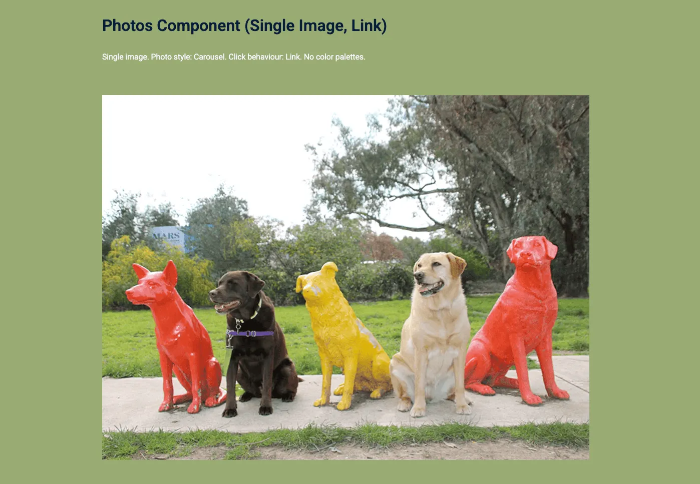
Section titled “Single image”If only one image is uploaded, it displays as a full-width image regardless of the selected photo style.
All fields (technical reference) — 16 fields
| Field name | Machine name | Type | Role |
|---|---|---|---|
| Click Behaviour | field_dmz_click_behaviour | list_string | Editor |
| Hidden | field_dmz_hidden | boolean | Editor |
| Buttons (legacy) | field_dmz_links | link | Deprecated |
| Background Media | field_dmz_media | reference (image, video, fotoweb) | Admin |
| More Link | field_dmz_more_link | link | Editor |
| Outer Background | field_dmz_palette_color_1 | list_string | Admin |
| Inner Background | field_dmz_palette_color_2 | list_string | Admin |
| Content Background | field_dmz_palette_color_3 | list_string | Admin |
| Photos | field_dmz_photos | reference (image, fotoweb) | Editor |
| Photo Link | field_dmz_photo_link | link | Editor |
| Resize Options | field_dmz_photo_resize_options | list_string | Admin |
| Photo Style | field_dmz_photo_style | list_string | Editor |
| Section ID | field_dmz_section_id | string (max 255) | Admin |
| Introductory Text | field_dmz_text | text | Editor |
| Introductory Title | field_dmz_title | text | Editor |
| Title Heading Level | field_dmz_title_tag | list_string | Admin |