Related Content
The Related Content component displays a list of related content items. It’s often used at the bottom of a content page to suggest other items the user may be interested in.
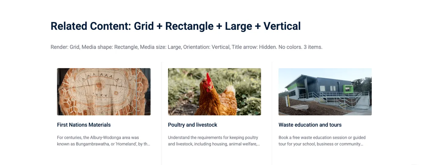
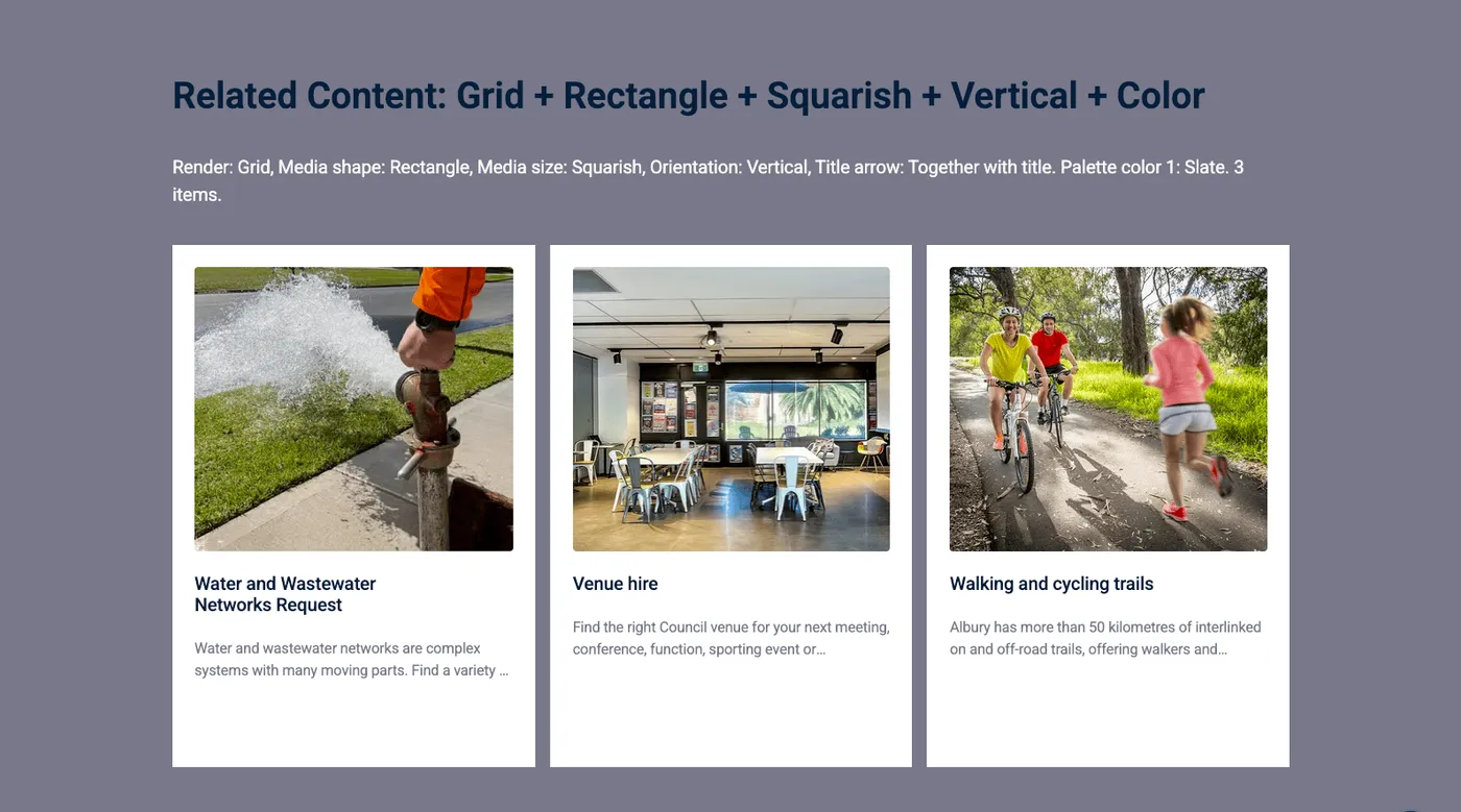
You can customise the appearance by choosing render options such as grid or carousel, and specifying the number of columns, media shape, media size, and more.
Intro tab
Section titled “Intro tab”Options in the Intro tab are covered in the Components section.
Related Content tab
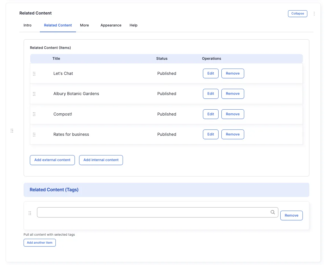
Section titled “Related Content tab”You can either specify content items individually, or pull multiple items by tag.
Content Items
Section titled “Content Items”Add individual content items by starting to type the title — autocomplete will suggest matching items.
Filter by Tags
Section titled “Filter by Tags”Pull content items that have any of the specified tags. This is useful for dynamically displaying all content tagged with a particular topic.
Appearance Admin
Section titled “Appearance ”Orientation
Section titled “Orientation”The option you’ll need in most cases. Displays items in a grid of cards or a carousel.
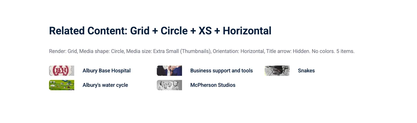
Displays items in a list, similar to the Links component, but with thumbnail images on the side.
Render Style
Section titled “Render Style”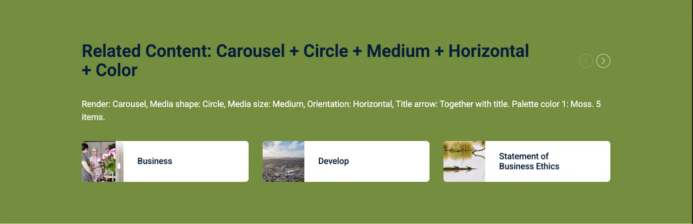
Cards in a scrollable carousel.
A split layout with one large card and three smaller cards.
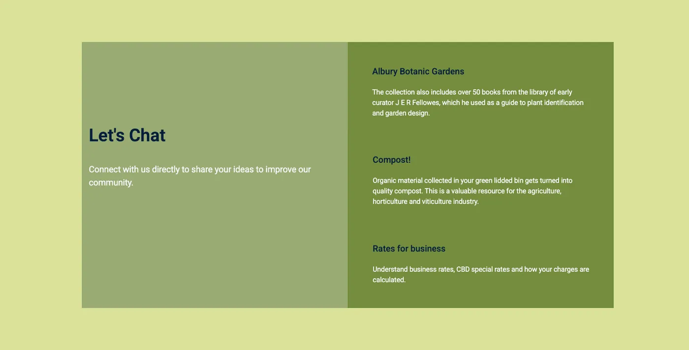
Cards in a collage layout with varied sizes.
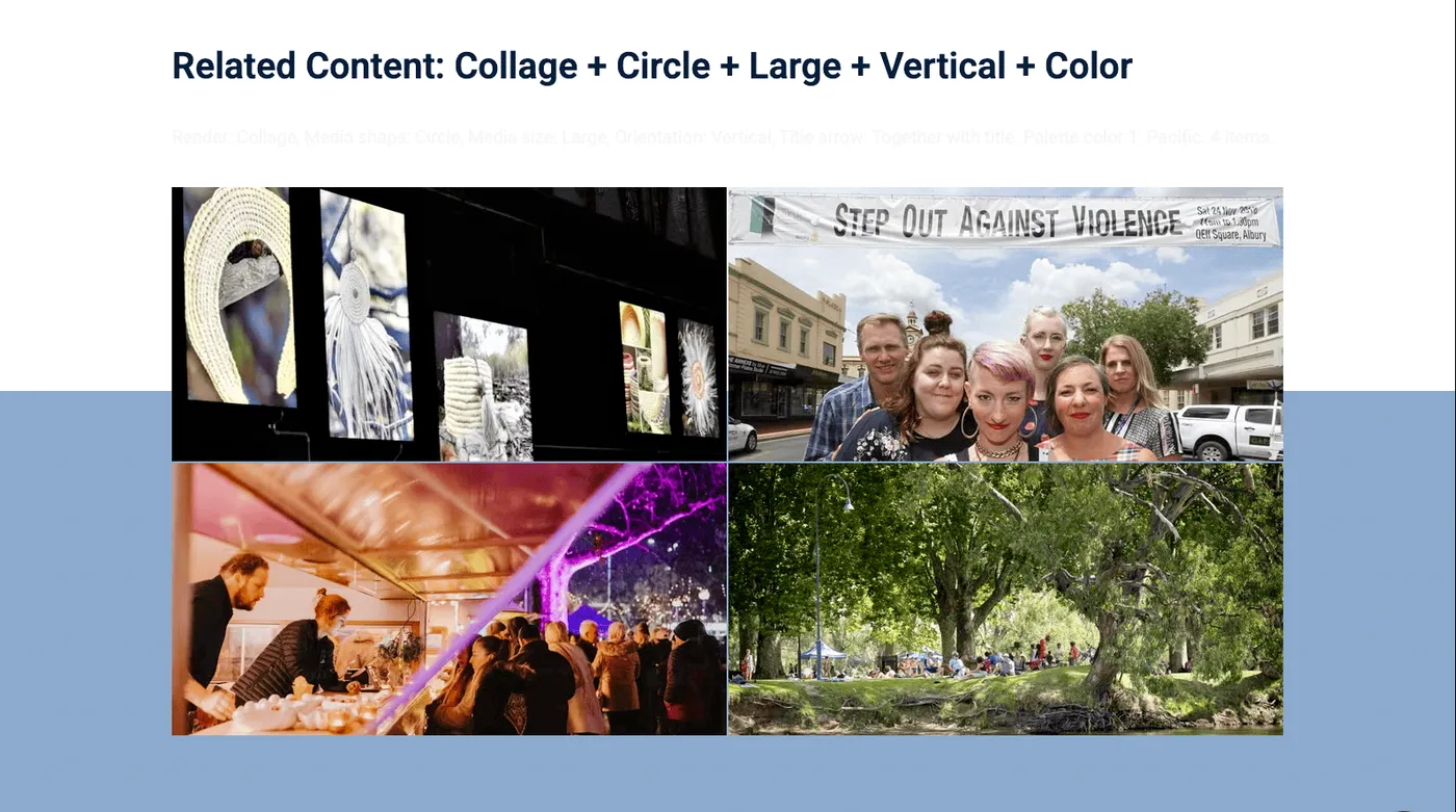
Columns
Section titled “Columns”Number of columns for the grid layout. On mobile, columns are reduced to one.
Carousel Rows
Section titled “Carousel Rows”Up to two rows can be in a single carousel. Sliding left or right scrolls ac all rows.
Media Shape
Section titled “Media Shape”Media Size
Section titled “Media Size”The size of the image in the card. Multiple options are available, but not all work with every render style and orientation.
Summary Lines
Section titled “Summary Lines”How many lines of the content item’s Page Properties > Summary are
displayed. If the summary has more lines, it’s truncated with ….
Title Lines
Section titled “Title Lines”How many lines of the content item’s Title are displayed. Truncated
with … if longer.
Info Level
Section titled “Info Level”How much information each card shows:
Border Style
Section titled “Border Style”Header Alignment
Section titled “Header Alignment”Magazine Style
Section titled “Magazine Style”Apply a magazine-style layout with varied card sizes.
Media Emphasis
Section titled “Media Emphasis”Whether the lead image is displayed normally or emphasized.
Examples
Section titled “Examples”Carousel
Section titled “Carousel”All fields (technical reference) — 27 fields
| Field name | Machine name | Type | Role |
|---|---|---|---|
| Border Style | field_dmz_border_style | list_string | Admin |
| Columns | field_dmz_column_count | list_string | Admin |
| Content Items | field_dmz_content_references | reference (external_links) | Editor |
| Render Style | field_dmz_content_render | list_string | Editor |
| Filter by Tags | field_dmz_content_tag_references | reference (tags) | Editor |
| Header Alignment | field_dmz_header_alignment | list_string | Admin |
| Hidden | field_dmz_hidden | boolean | Editor |
| Info Level | field_dmz_info_density | list_string | Editor |
| Media Emphasis | field_dmz_initial_media_style | list_string | Admin |
| Summary Lines | field_dmz_line_count | list_string | Editor |
| Buttons (legacy) | field_dmz_links | link | Deprecated |
| Magazine Style | field_dmz_magazine_style | boolean | Admin |
| Background Media | field_dmz_media | reference (image, video, fotoweb) | Admin |
| Media Shape | field_dmz_media_shape | list_string | Editor |
| Media Size | field_dmz_media_size | list_string | Editor |
| More Link | field_dmz_more_link | link | Editor |
| Orientation | field_dmz_orientation | list_string | Editor |
| Outer Background | field_dmz_palette_color_1 | list_string | Admin |
| Inner Background | field_dmz_palette_color_2 | list_string | Admin |
| Content Background | field_dmz_palette_color_3 | list_string | Admin |
| Carousel Rows | field_dmz_row_count | list_string | Admin |
| Section ID | field_dmz_section_id | string (max 255) | Admin |
| Introductory Text | field_dmz_text | text | Editor |
| Introductory Title | field_dmz_title | text | Editor |
| field_dmz_title_arrow | field_dmz_title_arrow | list_string | Editor |
| Title Lines | field_dmz_title_line_count | list_string | Editor |
| Title Heading Level | field_dmz_title_tag | list_string | Admin |