Page
The most common content type — a standard web page.
Content Types are the building blocks of the website. They define the structure and layout of the content, as well as the fields and components that can be used to create and manage it.
This page covers settings common to all or most content types. For specific content types, see the respective page below.
Page
News
Event
Place
Project
Service
Councillor
Meeting
Publication
Have Your Say
Most content types have a Content block which consists of components. Add components to the content to display different types of content — text, images, accordions, and so on.
See the Components documentation for more information on managing components.
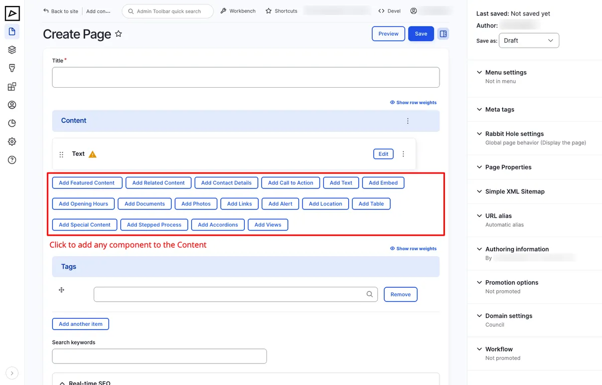
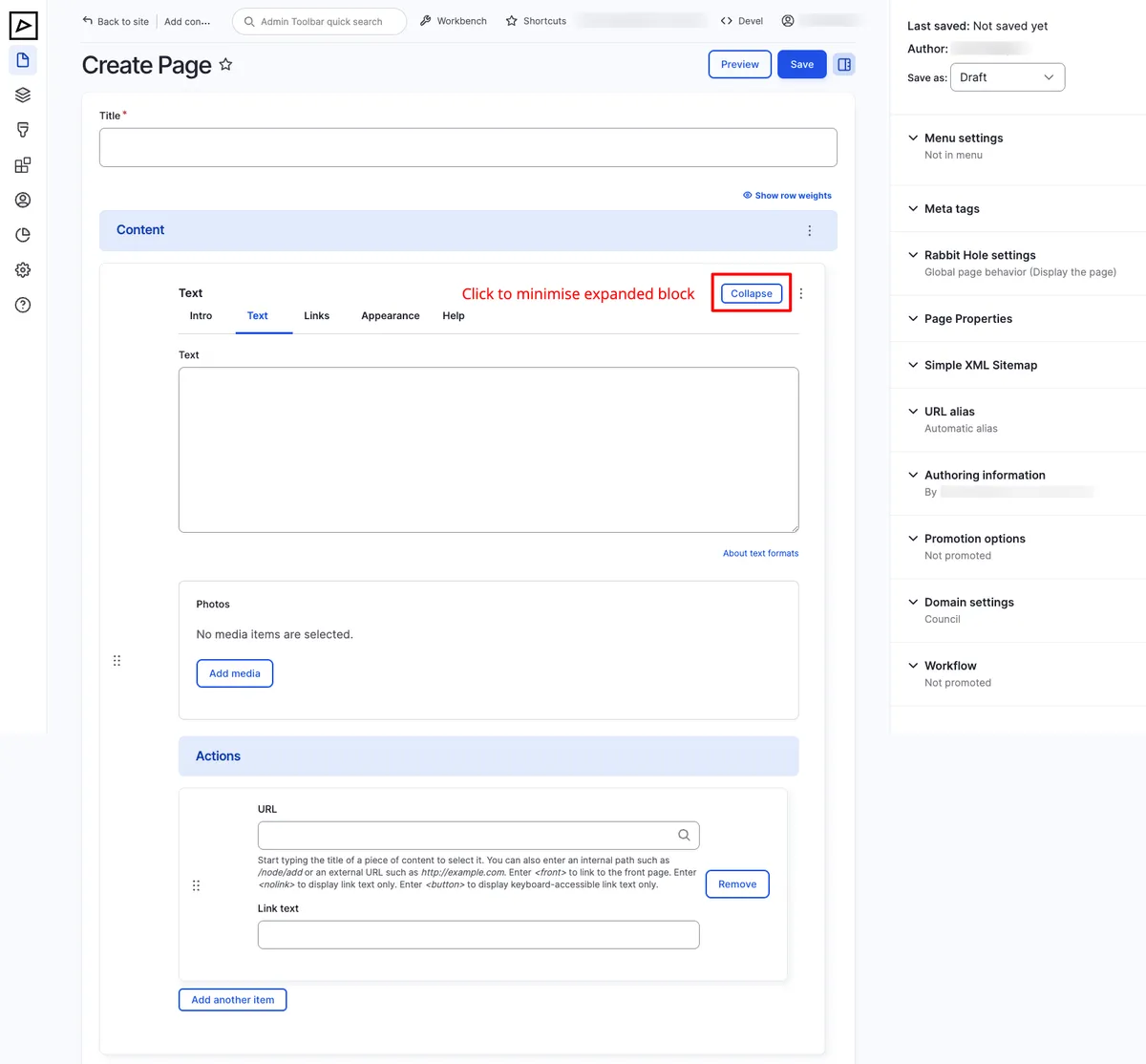
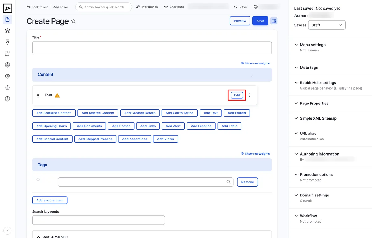
To expand or collapse a component, click Collapse / Edit.
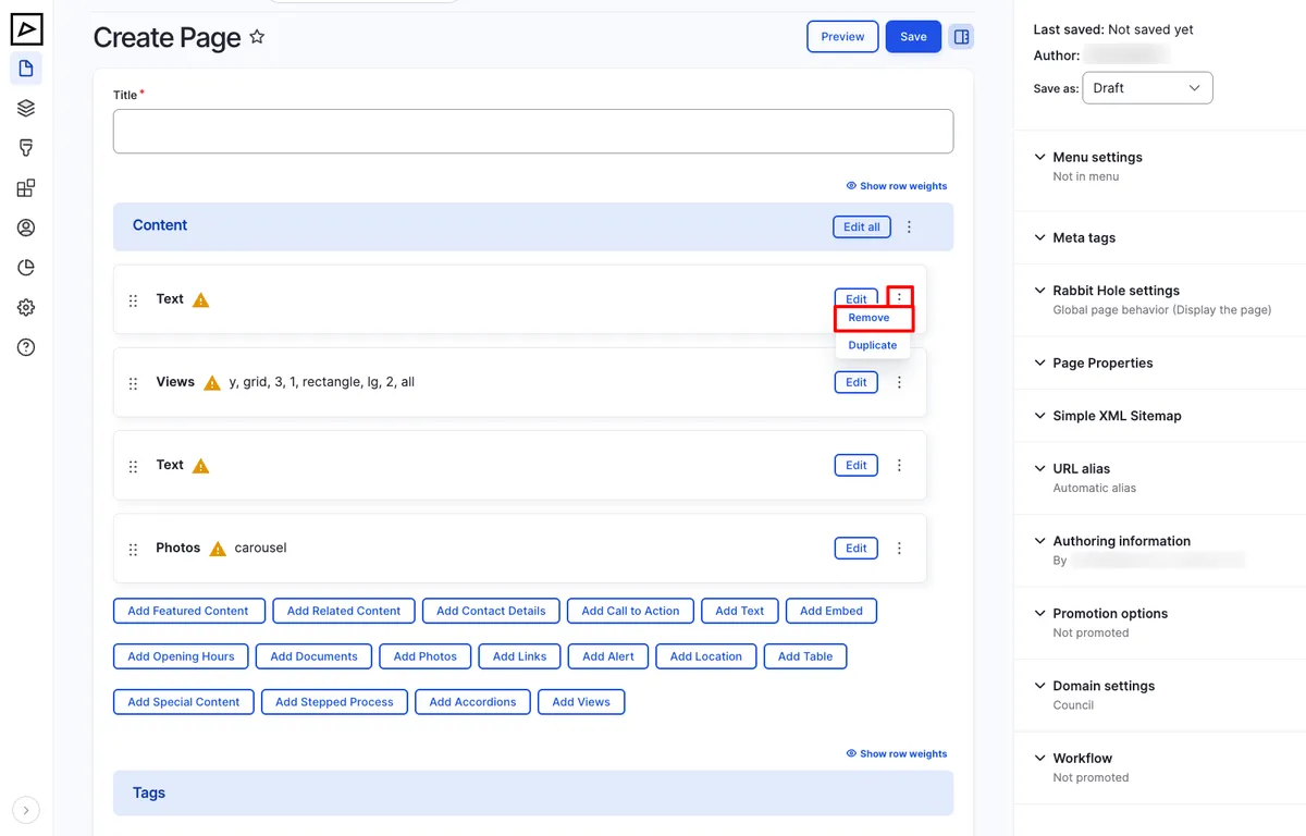
To delete a component, click the triple dot ⋮ and then Remove.
To change the order of components, hover the double triple dot ⋮⋮, then drag and drop the component to the desired position.
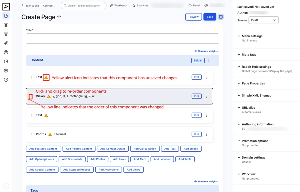
To preview how the content will look on the frontend, click Preview. Previewing helps ensure the content is displayed correctly and that all components are working as expected. It also helps avoid creating unnecessary revisions.
To save the content and continue editing, click Save & Edit. To avoid loss of data, save frequently — particularly when working on a long piece of content.
Page Properties Summary and Featured Image appear in:
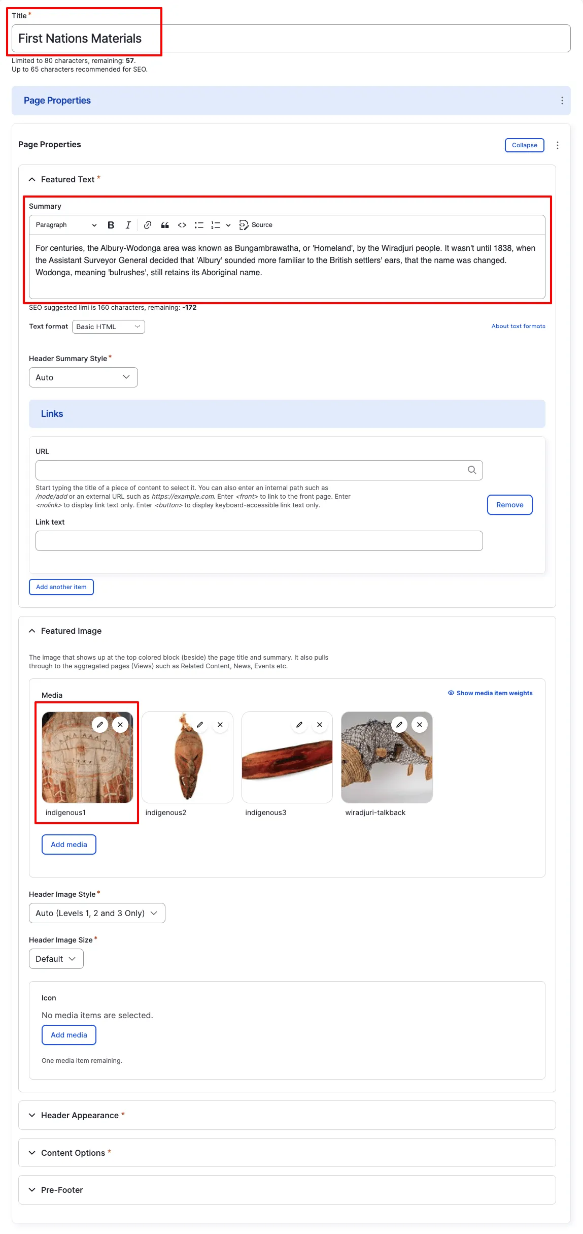
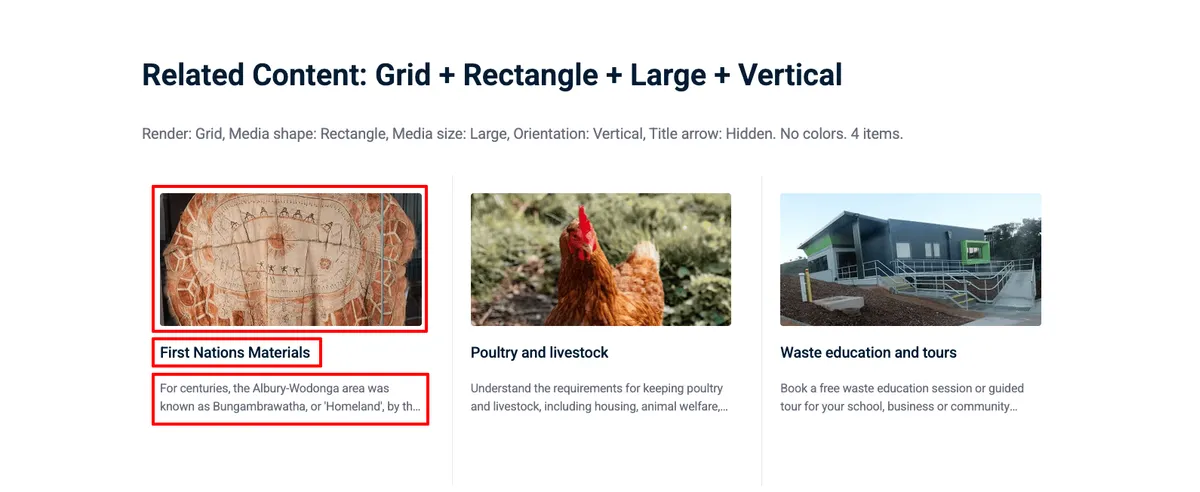
Short description of the content. Ideally under 160 characters to satisfy Google’s SEO description requirements.
The image displayed in the page header, listing cards, search results, and social media link previews.
Call-to-action links displayed in the header. Placement depends on the selected Summary and Header Appearance options.
You can add any number of links, although we recommend no more than two.
Workflows define the lifecycle of a content item — from draft to review to published. See Workflows for full details.
A typical workflow:
Content can be scheduled to publish or unpublish at a future date and time using the Scheduling options. This is useful for time-sensitive content like announcements or event registrations.